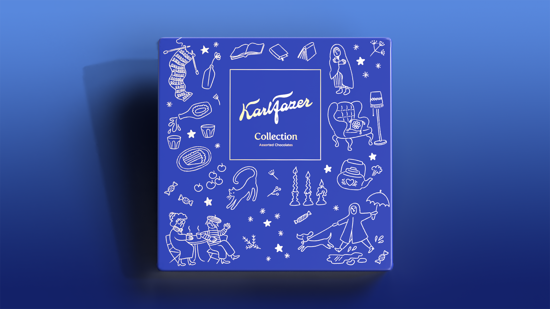
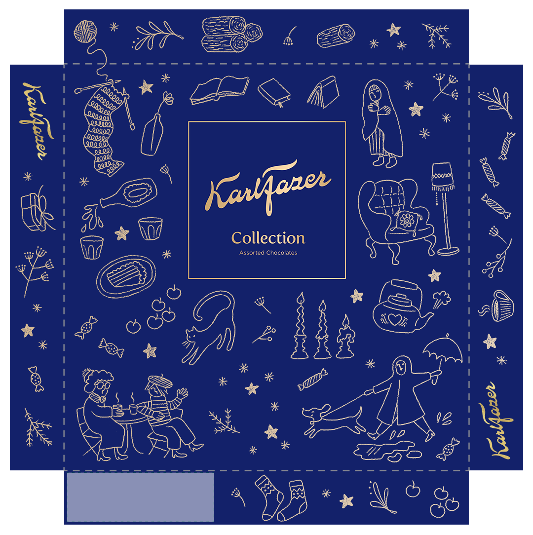
Illustration for Karl Fazer Collection chocolate box.


Because the chocolate box is a seasonal product, I wanted to convey a warm hygge-feeling without being too Christmas-y. That way the product is suitable for all the fall/winter months (which is a long time in Finland), not only December.

On their website Fazer promises to create memorable moments together by spreading joy in everyday life. This is the guideline I followed when planning the illustration. I wanted to show the beautiful moments of everyday life.
I chose a whimsical doodle style to give the illustration an approachable, authentic and friendly feel. The colors were an easy choice: the distinguished Fazer blue combined with a complimentary gold lineart.

The themes I chose for the illustration were inspired by the daily mundane life of Finn’s during the coldest time of the year. The question that guided me was: “What would a chocolate pair perfectly with?” Examples I came up with were a good book, endless knitting, a hot beverage, a holiday get-together, cozy woolly socks, two grandmas enjoying glögg at a cafe, a sleepy cat, warm candle light, logs for the fireplace, your comfiest chair and of course a daschund excited about rain puddles.

Illustrator – Kristiina Rissanen
Logo, design elements, layout – Fazer
Entry for Fazer illustration competition
