Convinience food based on seasonal, local and wild ingredients ingredients.
BRIEF A company founded by three top Finnish restaurants during the pandemic produces 3-star ready-to-eat food and builds a brand around it. The name of the product is Personal Chef. The meals are the same as offered in the restaurants, every package comes with instructions for preparation and serving. The target group is middle-class families with children. The brand strives for market leadership in high-quality convinience foods. The price of the product is higher than the supermarket’s other competing products.
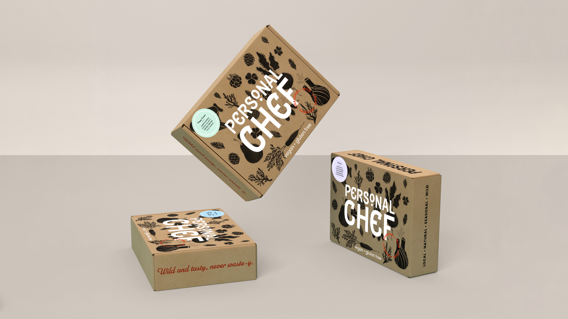
My take on Personal Chef is meals made from vegan, local, seasonal, natural, harvested wild ingredients. The meals come in packaging that reflect these attributes.
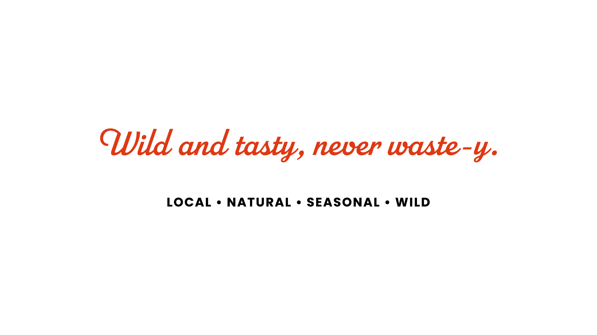
The visual identity has a rustic and approachable feel. For the logo I chose Epitaph from Adobe Fonts as the type has a distinctive, vintage look and eccentric E’s. The alternate O gives an extra flare. For the main brand font I chose geometric sans-serif Poppins for it is round and friendly, yet bold and accessible. I paired it with handlettering-inspired script typeface Parkside. The colors are simply black and white with a pop of bright red. The emphasis is on the organic materials of the packaging, which also is extended to the marketing materials.
The packaging is made from recycled cardboard, covered in hand-drawn illustrations, with the attributes stamped on the side. The brand values are summarised in the slogan: “Wild and tasty, never waste-y.”
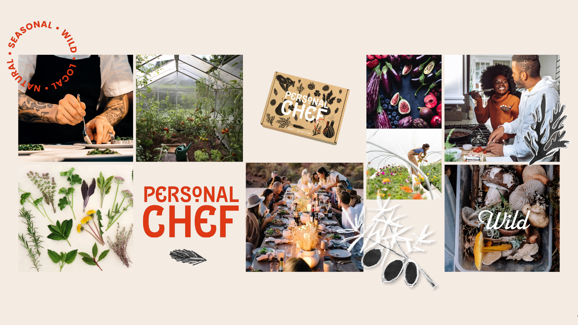
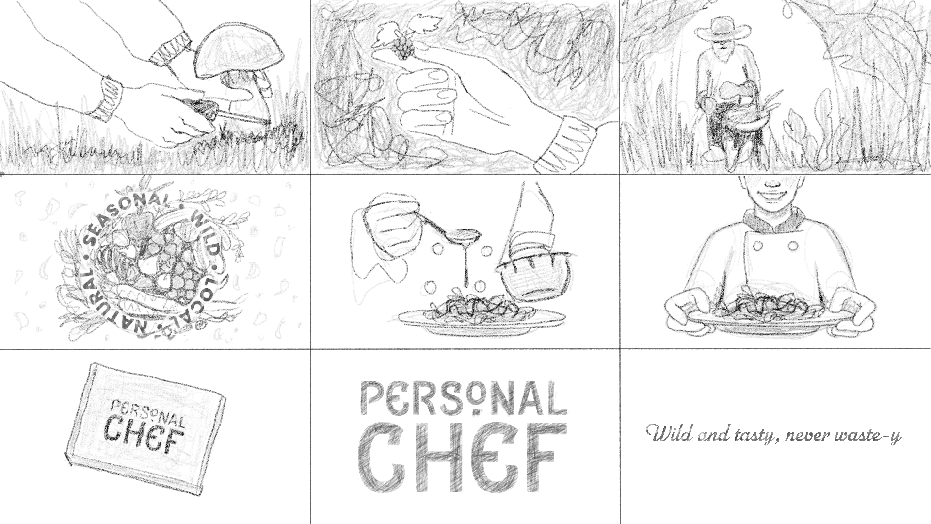
The moodboard suggests how the brand would be presented in social media. The storyboard is for a short advertisement video on Youtube.